Using Clustering Algorithms to Identify Distinct Pitcher Release Points
Some of the many data points captured by Statcast show the point in physical space where a pitch left the pitcher’s hand. We capture the lateral distance from the center of the rubber (X), distance from home plate (Y), and the height off the ground (Z) for almost every pitch going back to 2015 (future Statcast advancements, such as skeletal tracking data, may provide a more robust set of data on pitching motions).
There are numerous documented examples of pitchers intentionally and unintentionally varying their release points from pitch to pitch. When unintentional, we usually refer to it as “pitch tipping”, where an exploitable pattern may reveal itself. When intentional, it can be an attempt at deception (Johnny Cueto is a well-known example). Part of the tug-of-war between pitcher and batter is the attempt at unpredictability from the former, and the attempt to discern patterns by the latter. Where release points vary, the potential for an exploitable pattern exists. Statcast allows us to more easily identify such patterns. It turns out, they aren’t as uncommon as one might think.
Aaron Nola threw 102 pitches on May 1, 2019 against the Tigers. The graphic below from Baseball Savant is a visual representation of the release points of each pitch he threw that day. The colors delineate pitch type, and there seems to be a pattern.

Below is a similar graphic showing a Tyson Ross start with no apparent pattern.

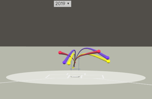
And here’s Yusmeiro Petit throwing 34 pitches (his season high) against St. Louis, showing a pattern different from Nola’s.

Interested parties can follow this link to Petit’s graphic and click-and-drag to change the angle or zoom to their heart’s content (navigating to similar graphics for other pitchers’ starts is not a terrible way to spend an afternoon, in this author’s opinion). In so doing, it should be clear that the apparent patterns above are not just tricks of the angle. We should not have expected every pitch thrown by the same pitcher to be released from the same exact position in physical space; no one is that precise. But we do expect, with a few exceptions, that pitchers will try to replicate their deliveries and that the variation will be small and random.
So, the graphics above present a few obvious questions. How common are patterns like Nola’s on both an inter- and intra-pitcher basis? Is this an attribute of Nola’s, or just an unusual start? If the former, is he unusual or are these patterns common? Put another way, are some pitchers “better” at keeping their release points consistent than others? And if significant intra-pitcher release-point variation is common, does it tend to correlate with any specific in-game contextual factors? The K-means clustering algorithm can begin to address some of these questions.
I started with a data set of 707,905 pitches, about 97% of all pitches thrown in 2019. From there, I grouped pitches into one of three buckets, which I will refer to as “inferred set positions” from here on: 1) all of a pitcher’s pitches thrown as the starting pitcher with the bases empty, 2) all of a pitcher’s pitches thrown as the starting pitcher with runners on, 3) all of a pitcher’s pitches thrown during relief appearances. Each group, in theory, should consist of pitches with deliveries intended to look the same and being released from the same point. I discarded groups where n < 100.
To establish some scientific support for intra-pitcher variation in release points (the Nola or Petit pattern), I wrote an R-script that considered each pitcher in the data set one at a time, and clustered his pitches twice, using k = 2 and k = 3 where k is the number of clusters, using only the X, Y and Z-coordinates of the pitches as inputs. What this did, effectively, was group the pitches into configurations of two and three groups where the groups differ the most from one another. I also calculated, for each pitcher, a “gap statistic” (more on that here), which helps us derive an “optimal” number of clusters (between 1 and 3) for each pitcher’s pitches. If, for a given pitchers’ pitches, the gap-statistic for k=1 is higher than that for k=2 or k=3, there’s no reason to assume variation of release-point beyond perhaps some slight randomness. If the highest gap statistic for a pitcher was at k=2, I would take this as evidence he has two distinct release points.
As an example of how this worked, I’ve excerpted Nola’s bases-empty starting pitcher results in the screenshot below. There were 2,062 pitches in this group and, according to the gap-statistic method outlined above, his pitches seem to have three distinct release points or, put another way, it is more sensible to believe he has three than two or just one with random variation around it. Beyond that, the segmentation also seemed to group by his three primary pitch types, as evidenced in the three rightmost columns. Again, the only inputs into the k-means algorithm were the X, Y and Z coordinates of the release points, so the algorithm was not instructed to segment by pitch type, but it did. This suggests not only that Nola has three distinct release points but that he has a distinct release point for each of his three primary pitches. The graphic at the start of this piece showed one start, but the pattern illustrated in that one start now has scientific backing based on a full season’s worth of his pitches.

The cluster primarily containing Nola’s breaking pitches (cluster 1) has a median release point slightly higher and farther from the plate than the others. His fastball’s (cluster 2) median release point is about half a foot closer to the plate than that of his curve and his change-up’s (cluster 3) median release point is the lowest of the three and the closest to third base. To better illustrate this visually, baseball savant allows one to click “arsenal” below Nola’s (or any pitching appearances) graphic. It will show the “center” of each pitch type’s release point, split by batter handedness. Note the orange and red pitch trails that seem to overlap; these are two- and four-seam fastballs respectively, generally released from similar positions but with different grips and trajectories.
Lest it sound like I’m picking on Aaron Nola, cases like his are not uncommon. By my methodology, 49% of pitchers in this data set have more than one distinct release point (from at least one set position, if not both). Broadcasting the pitch that is about to be thrown, in any manner, is obviously sub-optimal. There’s a reason, after all, that catchers don’t just yell “slider, low and away” from their spot behind the plate. It’s unreasonable to believe that such variation is necessarily obvious to opposing hitters in real-time, or even obvious to the pitcher’s teammate and coaching staff without the assistance of video (or, even better, baseball savant). Documented, obvious cases of pitch tipping are still rare, but the distribution of consistency-of-release-points may be enlightening or even surprising.
To further understand release-point variation, let’s compare the physical distance between clusters for each pitcher and observe the variance in that. For this, I’ll disregard the “optimal k” and just look at the two-centroid clustering solutions. In so doing, I’m observing the distribution in how far apart each pitcher’s two most-distinct release points are. More-consistent pitchers should have their clusters closer together than less-consistent pitchers, but what does this distribution look like? Pitchers with more-consistent deliveries will be toward the left of the graph below.
It looks like, for both inferred set positions, the distributions take on the same bell-shaped curve with the same positive skew and a median of around five inches. Perhaps pitches from the stretch skew a little less consistent, but not dramatically so. Remember Tyson Ross’ graphic at the start of this article? He has the most-consistent release point for pitches likely thrown from the stretch, with a median release point between the two clusters of 1.78 inches. From the full windup, he ranks third. Whether he’s throwing his fastball or his slider, he’s releasing the ball from roughly the same spot. Unsurprisingly, the algorithm believed his optimal-k to be 1. Of course, this consistency did not translate into a successful season for him.
More extreme are the cases of Adam Kolarek and Clayton Richard, whose most-distinct release points per the two-centroid clustering are almost two feet apart. This can’t be accidental, and video of the two pitchers suggests it isn’t. In both cases, regardless of likely set-position the larger of their two clusters contained 78–88% of pitches thrown and the clustering is likely differentiating pitches intentionally thrown from different arm slots. Clayton Richard’s July 1st outing against Kansas City shows this pretty clearly. Kolarek is a lefty reliever who generally throws side-arm but seems to occasionally adjust to a more over-the-top delivery for his four-seam fastballs. Video of both of his deliveries suggests this is also intentional.
Now it’s worth asking what might cause some pitchers to have multiple distinct release points. To address this, I calculated the distance of each pitch from its pitcher’s median X, Y, and Z-coordinates, again keeping the stretch separate from the full windup. I’ll call these “distance deviation” measures. I then ran another k-means segmentation on just those distance-deviation measures, using only a sample of the pitches (randomly selected across multiple pitchers) in the dataset. The outcome showed, pretty clearly, two segments. These segments can be thought of as the group of pitches most-different from the other group.
As with the intra-pitcher clustering, I summarized the clusters based on a number of in-game contextual and pitch-mix factors and the two clusters look very similar in every respect except for pitch type. The clusters aren’t split on opposing-batter handedness, nth-pitch-of-the-game, the score, whether the pitcher is in his home or away park, but one cluster consisted mainly of fastballs while the other was more split between pitch types with about half being breaking balls. Or, put another way, when a pitcher’s release points are especially variable, it seems that this tends to be because he has a “fastball delivery” and an “other delivery” (or maybe more than one other delivery). In terms of positioning (relative to each pitcher’s median delivery point), pitches in the “fastball” cluster tended to be released slightly closer to the plate, from a slightly lower height and closer horizontally to the center of the rubber, all of which would be consistent with a slightly later release.
Yusmeiro Petit’s graphic above showed a split by batter handedness. Petit stands on different spots on the rubber for righties and lefties (though his optimal k = 3; it might have been higher if I’d allowed for k > 3). Petit had almost all of his 517 pitches to left-handed hitters in one cluster which was also pretty evenly split between fastballs and changeups. His other two clusters contained almost entirely pitches thrown to right-handed hitters, one of which was almost entirely fastballs, the other a more-even mix of fastballs and breaking pitches. It appears he attacks righties and lefties with different pitch mixes and from different release points. Tyler Duffy is another example.
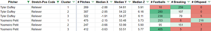
The graphics below summarize this more neatly, Petit first, then Duffy.

So these findings may not be especially surprising. We could have guessed something like the patterns described above occur naturally but we wouldn’t have been able to quantify and characterize it to this degree without Statcast data. We know that different pitch types are thrown in different ways and with different amounts of force behind them, so it should probably be expected that the point of release would differ somewhat. And we’ve established that there’s a spread in “talent” when it comes to keeping a consistent release point. If anything is especially enlightening here, it is perhaps how common it is that there are distinct release points that differ as much as they do. Generally, the different release points are probably not different enough that hitters will be able to observe an exploitable pattern, which doesn’t mean consistency is not preferable. Now, the primary outstanding question is, given that this variation exists, at what point will it start to really matter and become exploitable to hitters. With skeletal tracking in Statcast’s future, we’ll be able to understand this variation more holistically, by observing whether different pitchers have different deliveries instead of just different release points.

